My pen acquisition disorder (PAD) is settling down somewhat these days. I've collected a bunch of gel pens to use at the office, and I've discovered the awesomeness of fountain pens. So what's next? First, finding something interesting to write about. Second, finding some decent paper to write on. I discover interesting things to write about every day, so item one is easy (e.g., "Some moron cut me off on the way to work today" or "I wore black socks today" or "I made bad coffee today"). Item two presents more of a challenge, requires more thought, and takes more time.
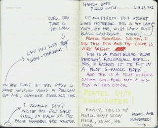
So . . . this post relates to some decent paper that I've been using recently. The paper is found inside a Leuchtturm 1917 Notebook (pocket size).
The Leuchtturm webpage for the pocket notebook is here, and a couple of online reviews can be found here and here. My abbreviated review is as follows: I like the Leuchtturm 1917 notebook more than the Moleskine pocket notebook, the Leuchtturm 1917 paper plays reasonably well with fountain pens, and they are less expensive than Rhodia notebooks (which many pen lunatics feel are the best in class). I like the fact that the pages are numbered, and I like the idea of having a table of contents at the beginning of the notebook. I may have to try a Rhodia notebook next for comparison, but I suspect that the Rhodia can't beat the "bang for the buck" value of the Leuchtturm 1917.
Is there even a point to be made here? If hard pressed, I guess my point would be to encourage notebook users to try a Leuchtturm 1917 instead of a Moleskine.
I wrote a test page in my notebook, made a really poor scan of it, and then used my amateur image processing skills to further ruin the jpeg file. Keep that in mind when you view this washed-out, white-imbalanced, and unrealistic color rendition:
Clear Key Caps
I made a pact with myself after I installed my last set of key caps on my Filco keyboard. I vowed to scale back on the key cap purchases and simply use and enjoy my mechanical keyboard. Some time during this self-imposed No Buy period, I browsed my way over to the Signature Plastics website, and saw something that made me immediately lift the ban. Transparent key caps. Game on.
I would love to have a keyboard full of clear key caps, but I'm not one of those keyboard uber-dorks who has all the keys memorized. For this reason (and for practical economic reasons), I decided to outfit only a portion of my keyboard with these icy looking key caps.
As shown in the above picture, I replaced the entire top row and the cluster of "navigation" keys on the right side of the keyboard (I have all of these keys memorized, and I rarely use the escape and function keys anyway). I really like the overall look of the keyboard now, and the transparent key caps really make the board look unique.
The key caps themselves are uncolored, i.e., they are not off-yellow, smoked, or merely translucent. They do have a little texture on the upper surface, which makes them look frosted when looking top-down.
The blue stems of the mechanical switches are visible through the transparent key caps (yes, my keyboard has Cherry blue switches). More eye candy for me = good.
I don't plan on updating this layout anytime soon. Yeah, sure. That's what I said the last time, and the time before that.
Subscribe to:
Posts (Atom)


